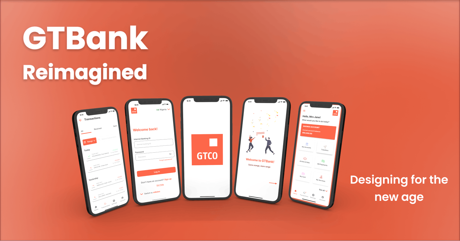
Guaranty Trust Bank's Mobile Banking Application Needed a Makeover: Here's How We Made it Happen


Overview
In addition to being one of the leading banks in Nigeria, Guaranty Trust Bank Limited (popularly referred to as GTBank) has for a long time embraced the digital movement by launching its mobile banking app. So, when our team was tasked with redesigning a Nigerian bank app based on feedback from its user experience, we decided to take on the challenge with GTBank’s mobile banking app as our case study.
We made it a point to find the users’ pain points while navigating the app, especially when it came to whether or not using certain features were providing them with a good experience. Our aim was to identify these problems and solve them through redesigning the current UI. This time, though, we would do it with a user-centered experience as our blueprint. We worked on this project for nearly a week, beginning on June 6, 2022, and concluding on June 12, 2022.
The Task
Using a Nigerian Bank App (could be FinTech) as a case study, carry out a user research on the experience. Using the feedback, redesign the mobile app. You must add a new feature and remove a feature.
Company
Guaranty Trust Bank Limited (GTBank) is a multinational financial institution that provides individuals, businesses, and private and public institutions across Africa and the United Kingdom with a broad range of market-leading financial products and services.
It is headquartered in Lagos, Nigeria, with subsidiaries in Cote D'Ivoire, Gambia, Ghana, Liberia, Kenya, Rwanda, Tanzania, Uganda, Sierra Leone, and the United Kingdom.
The Process
Identifying the Problem
To know how to solve the problem, we first needed to accurately define what the problem was. No doubt, we observed there had been many complaints about the application. Still, it was time to narrow down our scope and get to the specifics.
What better way to do this than good old research?
• Preliminary research
The team took to the internet to source for information. The GTBank application was launched in 2012, nearly ten years ago. So why then was an app with over five million downloads on the Google Play Store alone still grappling with a 3.8 star rating?
A good number of reviews had the answers.
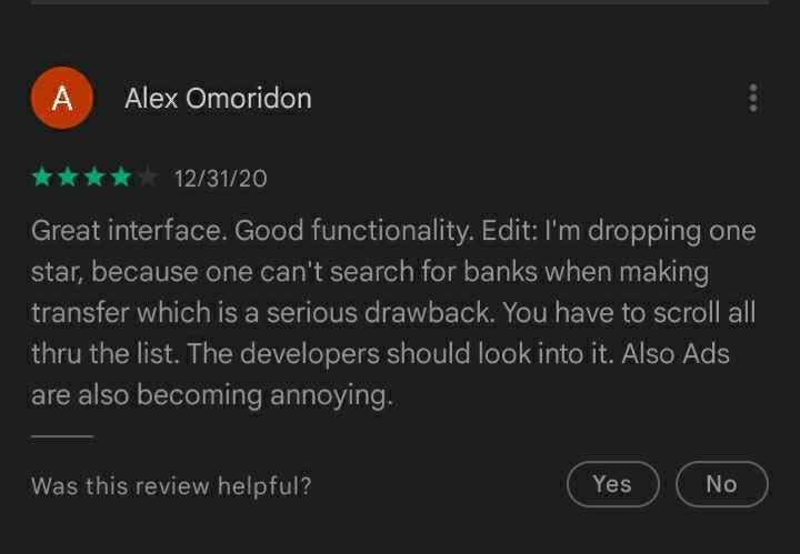
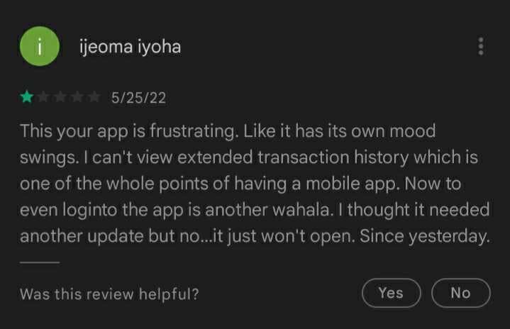
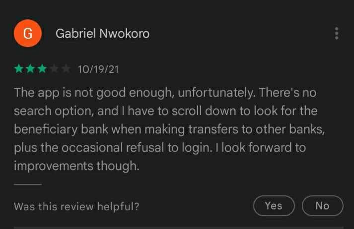
From the App Store:
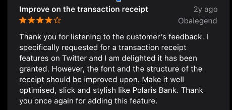
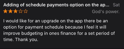
From not being able to search for banks or view an extended transaction history, to being unable to schedule transfers and a poor user interface, we knew we had been given a map on our journey to discovering root problems. However, who better than the users themselves to take us to that destination?
• User research
We conducted a customer satisfaction survey among GTBank's audience. The survey gathered 46 responses and the results were analyzed to further determine what problems users faced when using the application. This, in addition to what features they would like to see incorporated in the future.
The statistics were as follows:
- 93% of the participants admitted to using the app.
- 86% of the participants used the app often.
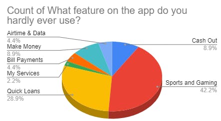
- 98% of the participants had some features they didn't use.
- 90% of the participants chose the services, cash out, quick loans, and sports and gaming as features they felt were irrelevant.
- Cleared transaction history, being unable to search for banks when performing transactions and poor service were the top three problems users had with the app.
- A search bar for banks during transactions, a virtual card and a detailed transaction history page were the features participants wanted most.
Problem Statement
After carefully analyzing the responses and reviews, we could say users' most recurring pain points while using the GTBank app were:
- No search bar for banks during transactions.
- No extended transaction history.
- No schedule payment feature.
Solution Plan
To begin with, we decided to address the users' most pressing concerns by:
- Creating an avenue to search for banks when making transactions.
- Providing an extended transaction history.
- Adding a schedule payment feature.
As agreed on by the majority, we also chose to discard the sports and gaming feature.
Finally, as a bonus factor, we planned to introduce an all new virtual card feature.
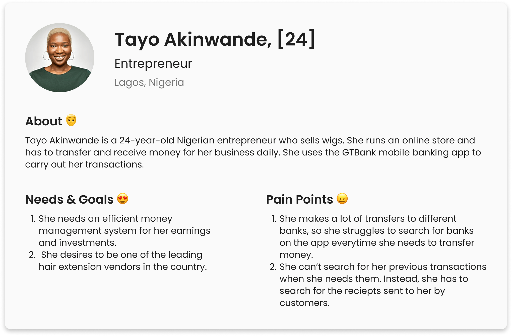
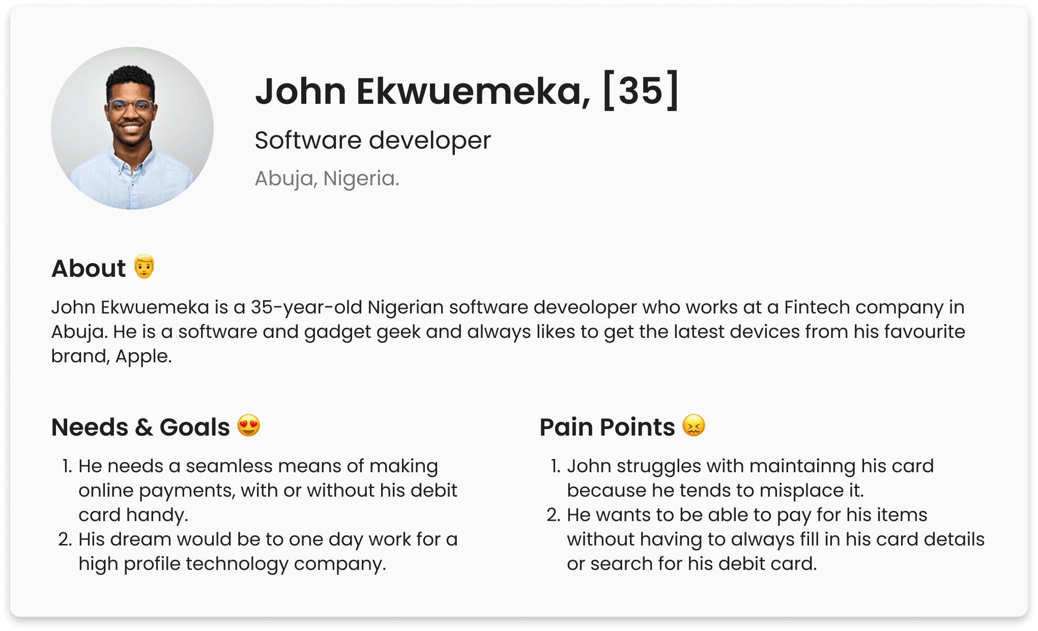
User Persona
We created user personas based on common patterns of the behaviours of our target audience. This helped us stay focused on users’ persistent needs and it constantly reminded us who we were designing for.
Design
With newfound insight and informed empathy, the team began to work on making our solutions operational by means of design.
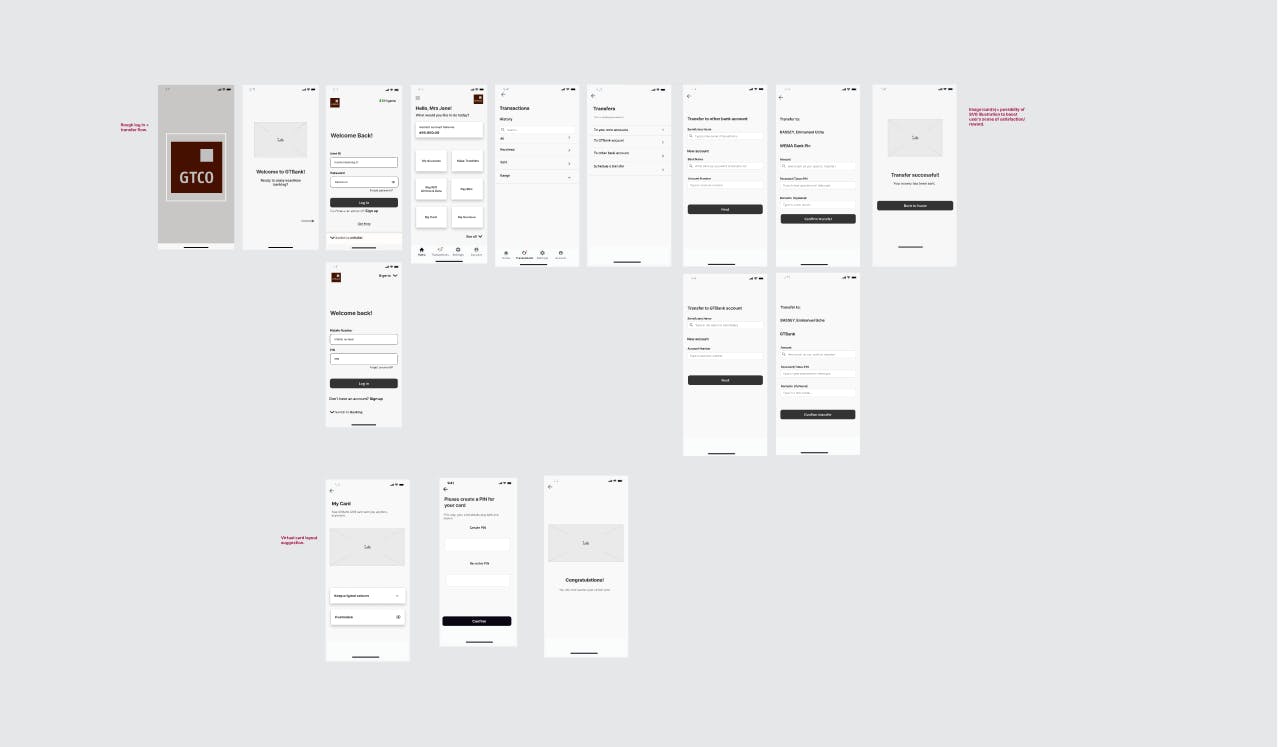
• Low Fidelity Wireframes
After some initial sketching, we created Low-Fidelity wireframes to have a blueprint for what our finished screens would look like.
figma.com/embed?embed_host=notion&url=h..
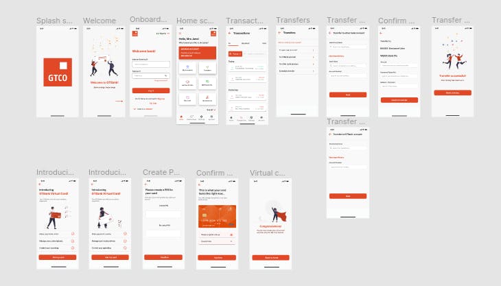
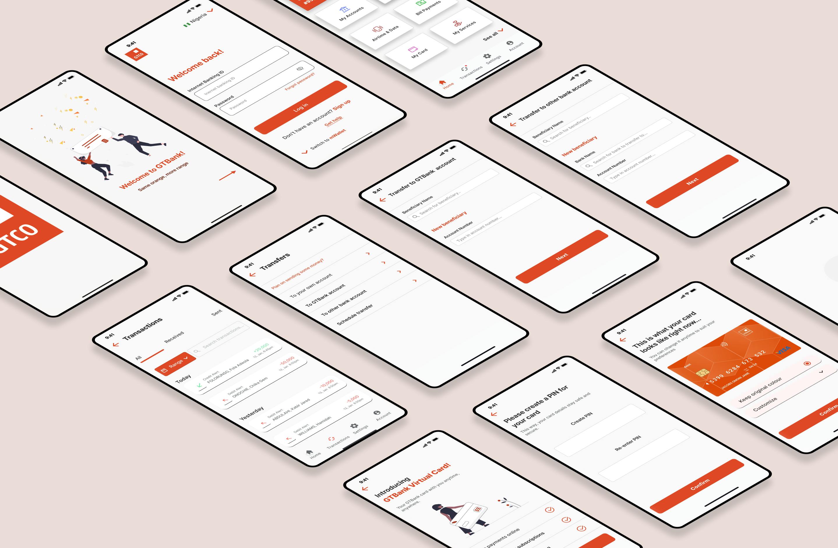
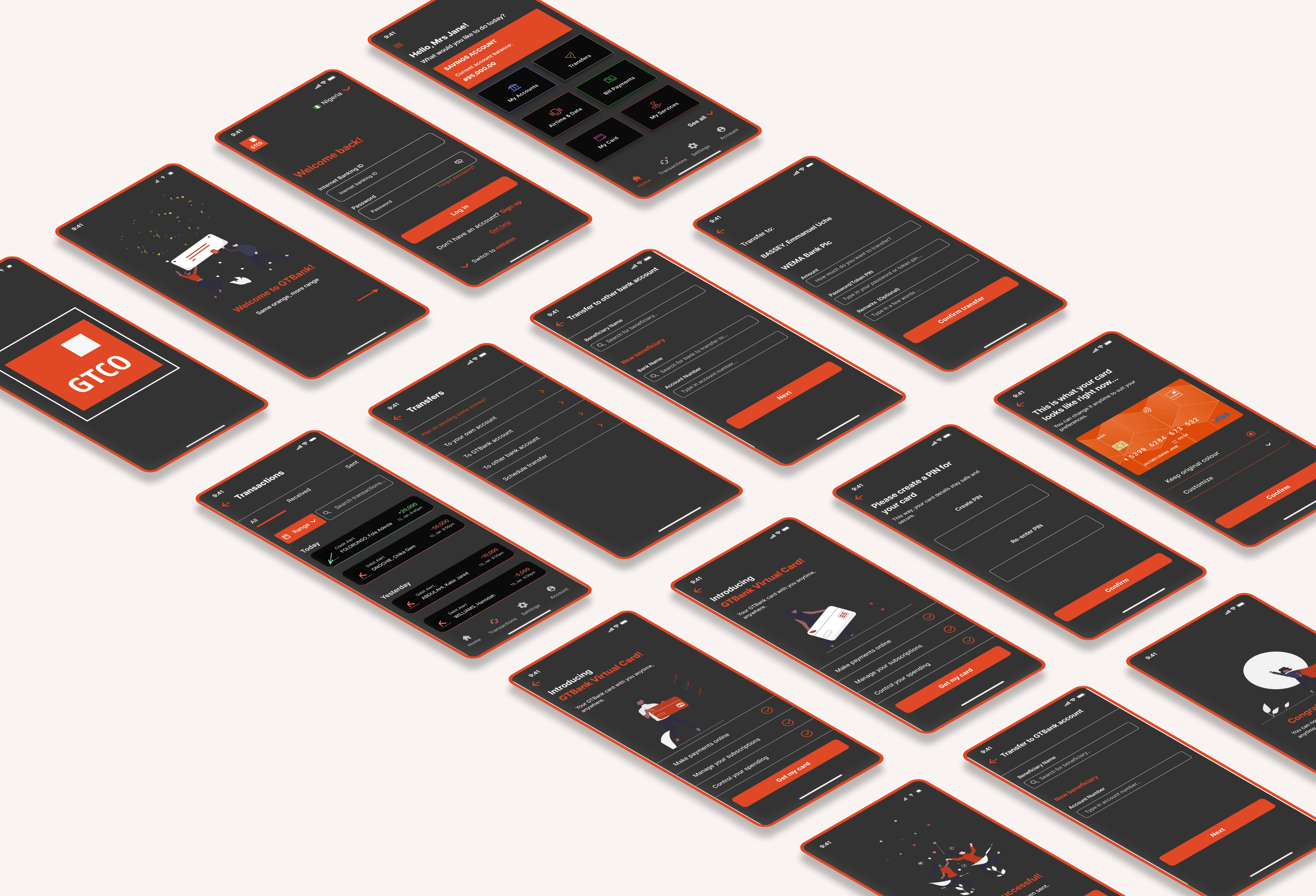
• High Fidelity Wireframes and Prototype
We had a pretty decent view of our wireframes once they turned hi-fi.
figma.com/embed?embed_host=notion&url=h..
Another perk?
We designed for dark mode.
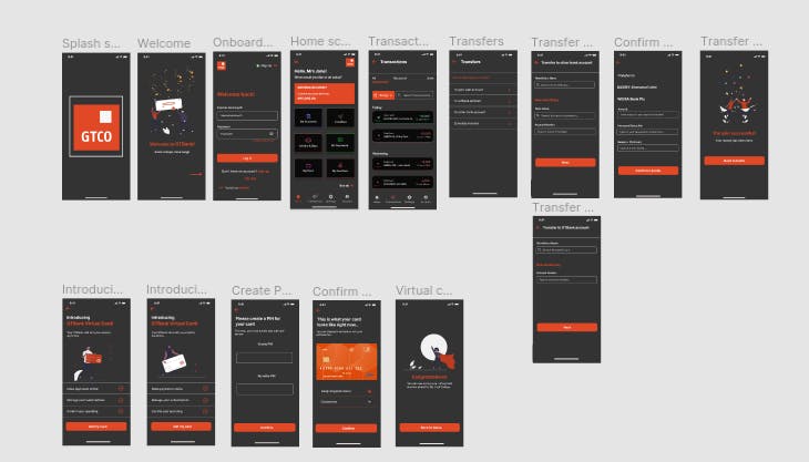
Because why should users still have to deal with an eye strain in 2022?
Major Changes
So what really changed between our updated UI and the original?
Let's take a deep dive to give you a closer look.
- We modified the splash screen.
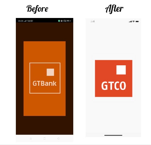
Whereas the first one appeared outdated and intense, we recreated a simple splash screen with an intended one-to-two second appearance of the new Guaranty Trust logo to ease users into the application.
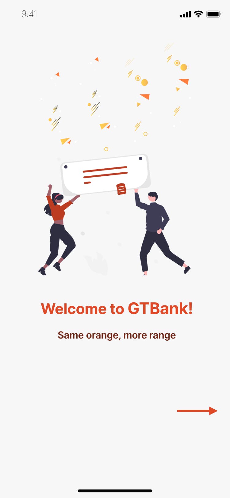
- A welcome screen was incorporated featuring the company's tagline. We figured it was a simple way to give the users a friendly welcome.
Besides, with all the seriousness going on in the world, who wouldn't appreciate a little bit of fun?
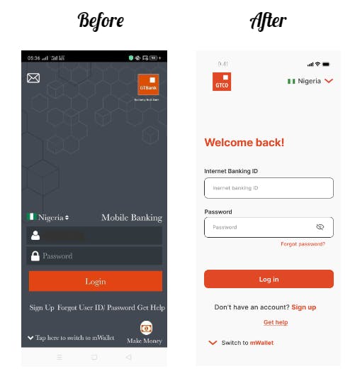
- We altered the login/sign up page. The placements of a few icons were changed such as the GT logo and the drop down for country selection. Some unnecessary icons were also taken out such as the mail and those located within 'input text' fields.
Most important though is that we changed the typeface to make scanning information much easier and comfortable for the users.
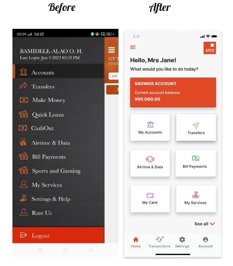
- We completely revamped the dashboard/home screen. We sorted the features into container formats with illustrative icons, set a bottom navigation bar for the most important functions, and used a personalized greeting to convey a feeling of warmth and empathy. We generally gave the page a more organised and modern appeal, both elements which were lacking in the original.
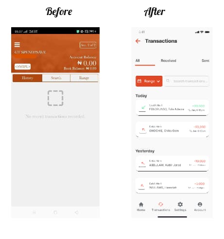
- The transaction page was modified to include an extended transaction history, especially with the aid of the range tab. Users can now see transactions that have been made on their account, specify what kind (received or sent) by means of a slider to save time, and even search for specific transactions using an easily accessed search bar.
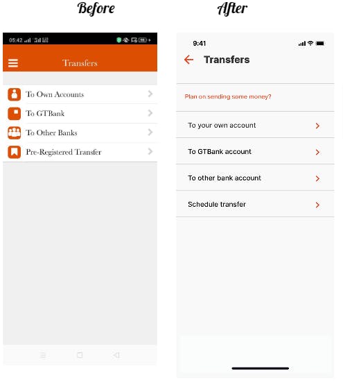
- On the transfer screen, we discarded unnecessary icons and added a schedule transfer feature. The page was made to look much simpler and offer only what the users needed.
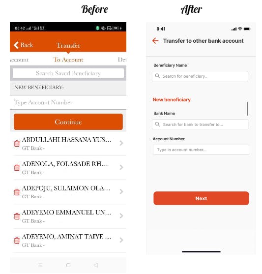
- On the transfer to beneficiary screen, we added the option to search for banks and made the 'search saved beneficiary' feature more direct and easy to process.
- We saved users' time on the transfer confirmation screen. Both screens from the original were merged into one, allowing users to both provide additional details of the transaction and approve all in one go.
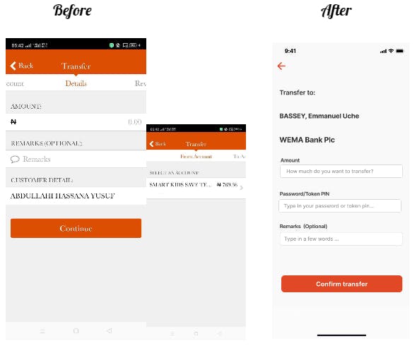
- Finally, in addition to confirming the transaction, a celebratory message is sent to the users to boost their sense of value and reward.
Why? Because they deserve it.
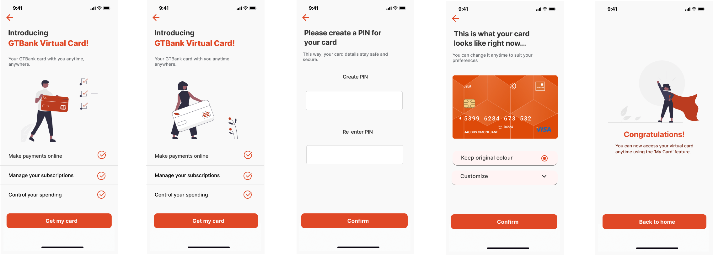
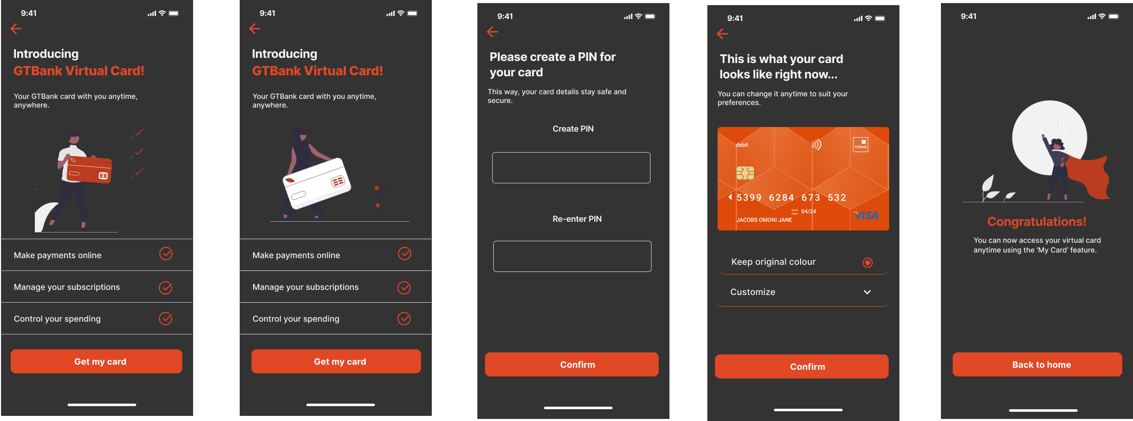
Introducing the GTBank Virtual Card
Earlier, we stated we would introduce a brand new feature. Rest assured, we kept our promise.
The virtual card is a feature currently used by many banks including GTBank's competitors across both the traditional and Fintech spheres. With the ease and convenience it already offers many users, it only makes sense that the demand for it grows and that more companies are incorporating it to market their brand and increase profit.
We thought it was a very reasonable feature to provide the GTBank mobile app users with, and we made the process of getting one as seamless as possible.
• First, the users would be introduced to the virtual card so they could get to know the benefits it offers. These include:
- Making payments online.
- Managing their subscriptions.
- Controlling their spending.
Both screens were created with the concept of alternating them at intervals to provide the users with a subtle expectation of something new whenever they clicked on the feature.
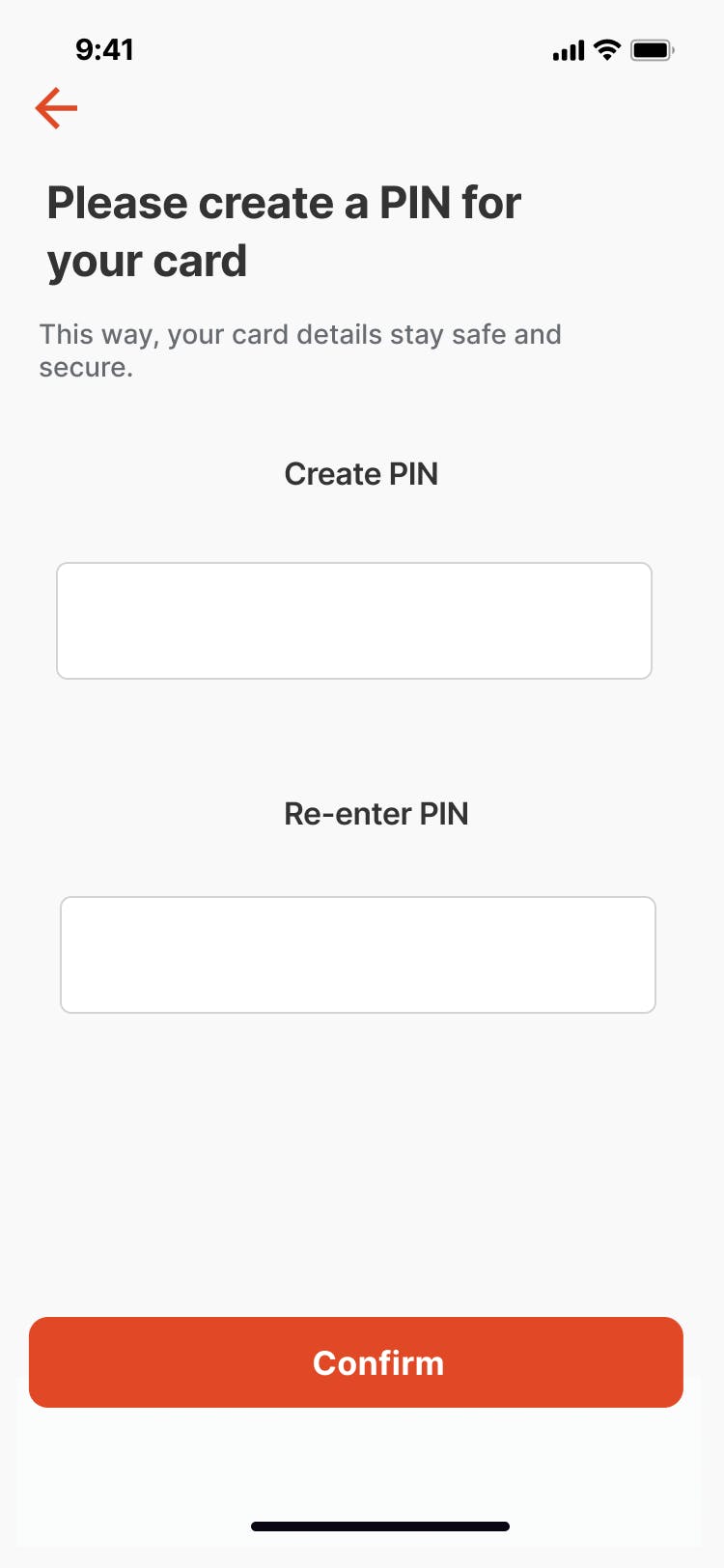
• Next, the users would be required to set a pin to secure their card.
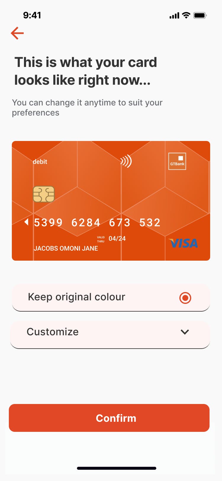
• Customization? Absolutely!
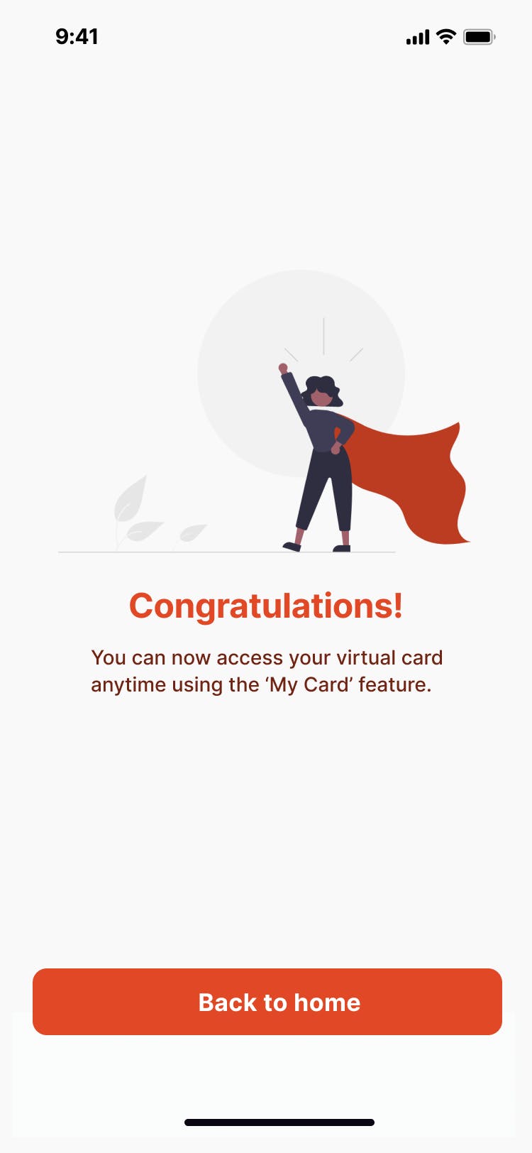
• Lastly, we would congratulate the users for completing the process and let them know they could now access their virtual card at any time.
They're happy, we're happy.
Here's a visual overview of the process.
Light Mode
Dark Mode
Final Thoughts
So that's about it! This case study serves to show how our team restored the GTBank mobile banking application through effective design. No one knows the users better than the users themselves, and it was why we made sure to empathize with them and solve the problems by considering their needs throughout the process.
This way, we not only created a solution that was good for business, but one that was first and foremost, good for people.
Who knows? If the bank implements these changes, their current ratings just might go up a star.
Thank you for reading!
The Team
- Eyimofe Jessica Williki
linkedin.com/in/eyimofe-jessica-w-47a266234
- Hamidah Bamidele-Alao
linkedin.com/in/hamidah-bamidele-alao
- Omega Abah
- Ameenah Ifedamola Hassan
linkedin.com/in/ameenah-ifedamola-hassan-49..
- Ugwuanyi Chimamaka
linkedin.com/in/chimamaka-ugwuanyi-735928240
- Nwankwo Nwachukwu David-Charles
linkedin.com/in/nwachukwu-nwankwo-738908167
- Abigail Onoise
linkedin.com/in/abigail-onoise-29993a241
- Akinremi Pelumi Esther