


Overview
Health monitors have been a very welcome introduction to the general market. With so many responsibilities to handle, heading to the hospital when all you need is as simple as a blood pressure check can end up being quite the hassle. The past week, our team was given options to choose from on what task to execute. We could design an analytics dashboard for either an e-commerce platform or a health monitor (application or web). We were required to take chart types, filters and more into account, as well as provide the most important features we felt users would need.
Our team decided on designing for a health monitor. For nearly a week, we thoroughly strove to create a means for users to easily stay updated on the status of their physical health. Core features such as statistics for blood pressure levels, heart rates, BMIs and more were incorporated.
Timeline
5 days.
The Task
Design an analytics dashboard (web or app) for a health monitor or e-commerce. Consider filters, chart types, and the core features/statistics the users would need most.
Note: The user interface for this platform will be displayed in desktop view.
The Process
Defining the Problem
People tend to deal with many responsibilities. From attending work meetings to shopping for groceries or picking up the kids from school, the human mind tends to stay occupied with a vast range of things. Considering this, frequently visiting the hospital for generic checkups (especially without any underlying health issues) could be adding one more task to the already long list of things. Unsurprisingly then, health monitors have been well received by the public to take some stress off that exercise.
Now, how were we going to create one that provided users with what they really needed?
Research
Due to the fact that this was new territory for many members of the team, we decided to source for and take a good look at already existent health monitors. This way, we could take note of recurring patterns/features and then see how best to implement them when working on our own project.
From this process, we discovered the most repeated features were:
- Blood pressure evaluators.
- Heart rate evaluators.
- Calorie intake trackers.
- Physical activity trackers.
Ideation
In addition to crating a user centered interface, we were aware we needed to give our health monitor a name. After much deliberation by the team, we decided to go with Sage Health.
In literal terms, sage is an aromatic plant of the mint family, generally known for its calm shade of green. Then, from another perspective, the word could also refer to someone profoundly wise. A combination of these characteristics informed the branding of our health monitor. The green which informed our color palette would convey a sense of growth and positivity. As for wisdom, those interested in the welfare of their health were already undoubtedly wise.
Solution Plan
To successfully accomplish this project, we decided to equip the analytics dashboard with five principal features:
- A blood pressure evaluator.
- A heart rate monitor.
- A calorie intake tracker.
- A steps tracker.
- A BMI profile and calculator.
We also decided to design separate screens for these features to provide users with additional data/statistics about each health profile.
User Persona
We created a simple user persona to serve as a guide for our design process.
Design
- Low-to-MId Fidelity Wireframes
As usual, we created low-to-mid fidelity wireframes that would serve as a base for our finished screens.
figma.com/file/1JbqtJ2vpyYZbhH30hfc06/Produ..
- High Fidelity Wireframes
Soon enough, our screens were finalized.
figma.com/file/1JbqtJ2vpyYZbhH30hfc06/Produ..
Showcasing the Features
For a better analysis, we've chosen to give a closer look into the features of the analytics dashboard for the health monitor.
- The Dashboard
The main dashboard displays an overview of the individual statistics included in the health monitor. It incorporates the user's profile/account on the top right, a search bar to easily access information, and the added features which include:
- A blood pressure evaluator.
- A heart rate monitor.
- A steps tracker.
- A BMI profile and calculator.
- A body temperature evaluator.
- A calorie intake tracker.
- A representation of the user's overall activity.
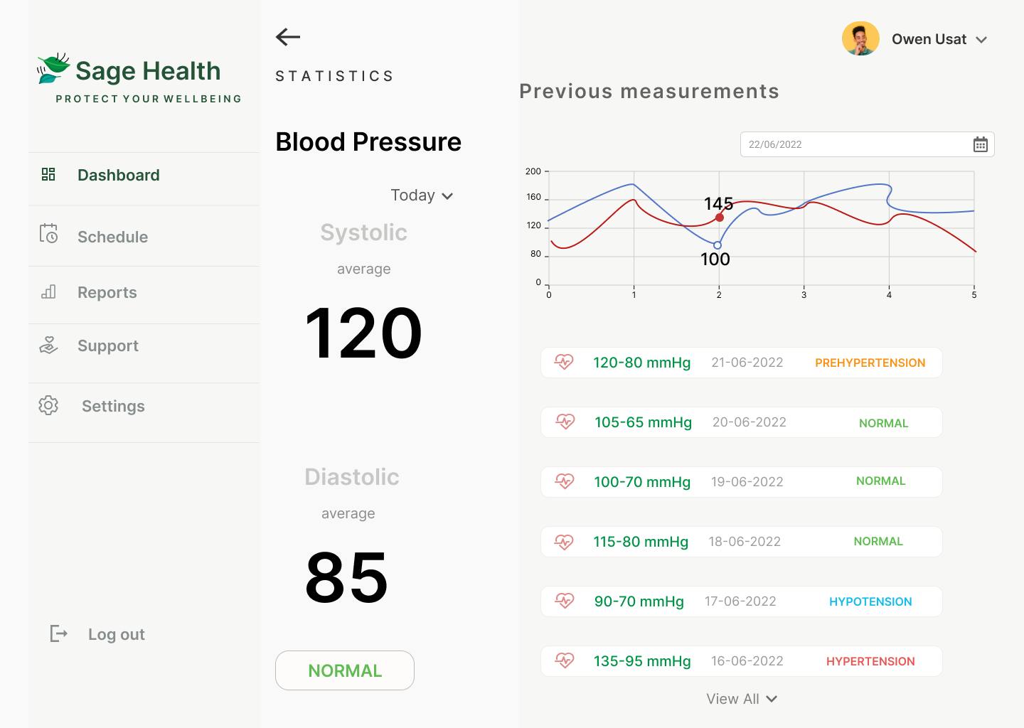
- The Blood Pressure Evaluator
This screen features the status of the user's current blood pressure as well as a line chart to illustrate the varying levels. Explanations of the statistics are included to let users know just what varying levels mean. A drop down option is also present to enable the user check their statistics for different periods of time.
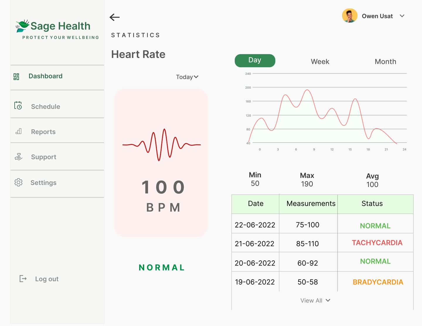
- The Heart Rate Monitor
This screen provides information about the user's current heart rate as well as tabular data and a chart for visual representation.
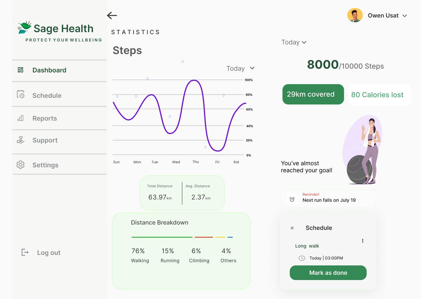
- The Steps Tracker
Users are able to set goals for the amount of steps they want to take for a chosen period of time. Furthermore, the health monitor lets them know just how far along they are in accomplishing those goals.
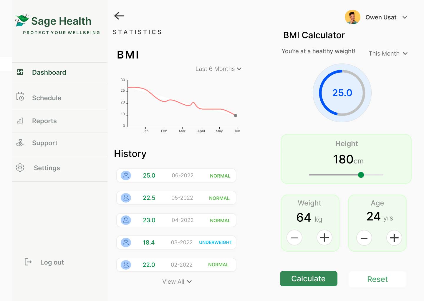
- The BMI Profile and Calculator
With the data the users input, the health monitor would be able to calculate their Body Mass Index as well as the status of their weight at intervals depending on that information.
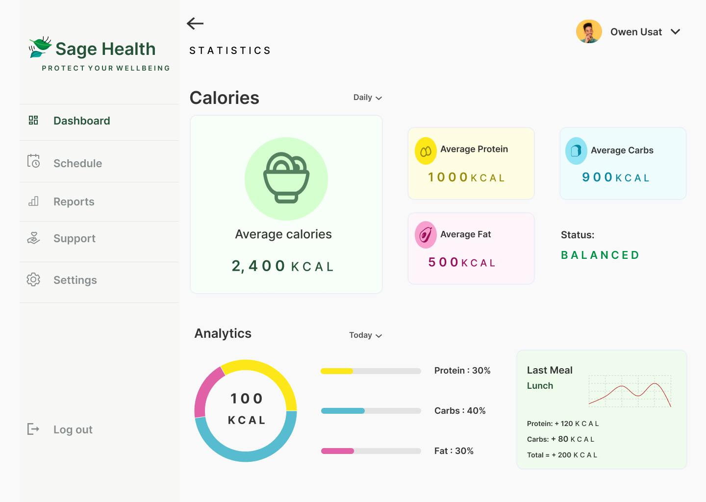
- The Calorie Intake Tracker
Calories are an integral part of a person's diet. With this feature, the user is made aware of the estimated number of calories they consume based on their meals over a chosen period of time. A pie chart is included for visual representation of that data and the calorie estimates are further broken down into food categories to aid accountability and understanding.
Final Thoughts
In summary, our goal was to do something different with this project. From the nature of the task to designing for a desktop view instead of mobile, we chose to challenge ourselves and see how well we could serve our users while facing new circumstances. In the long run, we worked hard to meet our targets and create an interface equipped to seamlessly cater to their healthcare needs.
Sage Health naturally has a lot of iteration in store. Nonetheless, we look forward to making those changes at a later time.
Thank you for reading!

The Team
- Eyimofe Jessica Williki
linkedin.com/in/eyimofe-jessica-w-47a266234
- Hamidah Bamidele-Alao
linkedin.com/in/hamidah-bamidele-alao
- Omega Abah
- Ameenah Ifedamola Hassan
linkedin.com/in/ameenah-ifedamola-hassan-49..
- Ugwuanyi Chimamaka
linkedin.com/in/chimamaka-ugwuanyi-735928240
- Nwankwo Nwachukwu David-Charles
linkedin.com/in/nwachukwu-nwankwo-738908167
- Abigail Onoise
linkedin.com/in/abigail-onoise-29993a241
- Akinremi Pelumi Esther
linkedin.com/in/pelumi-akinremi-9618391a6
- Zuliat Amuda